Beyond blue and white: the 2026 coastal color palette
The newest coastal rooms do not imitate the sea. They borrow its quietness — then build warmth through mineral neutrals, nuanced whites and a few beautifully grounded tones.
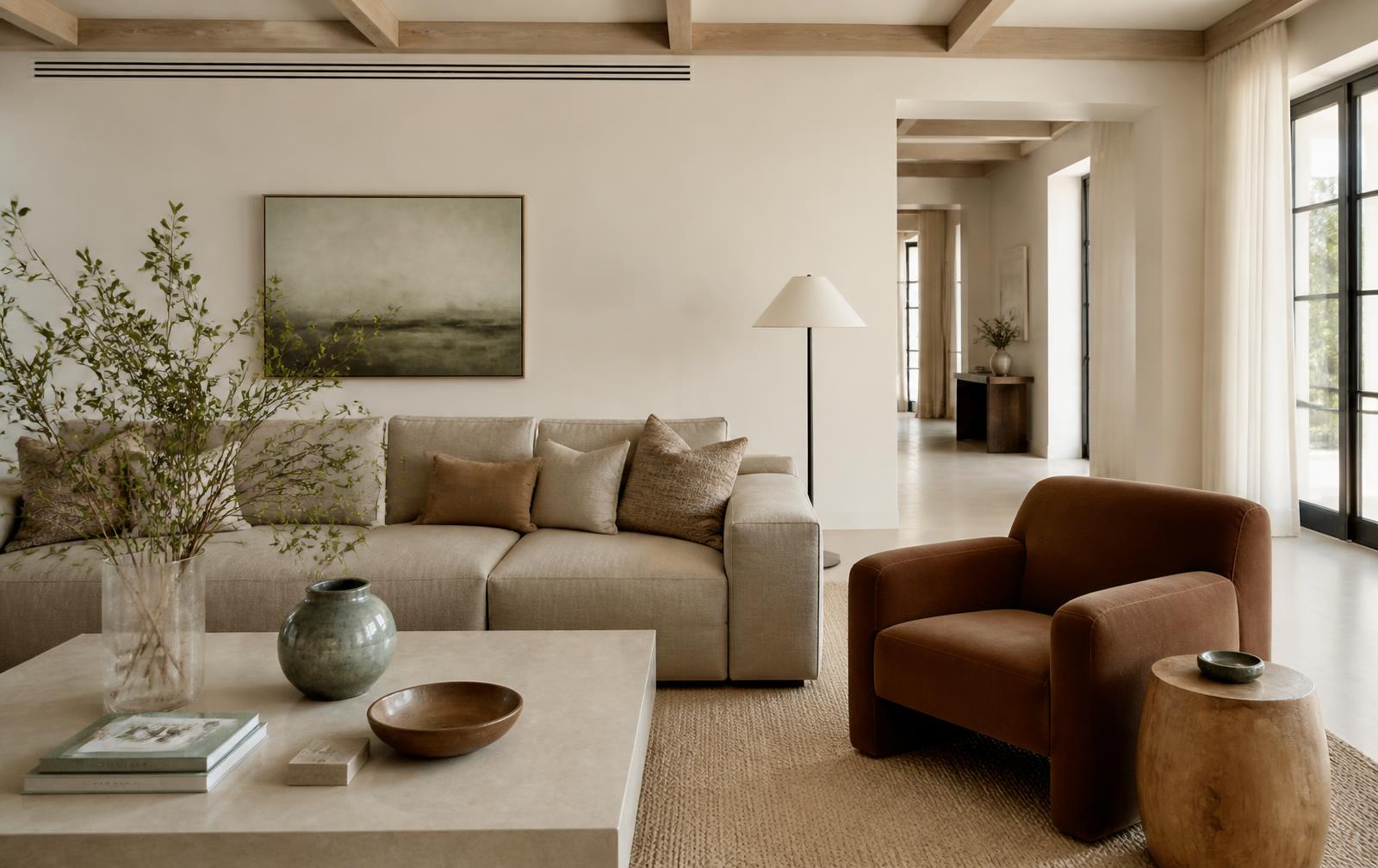
For years, coastal color meant a familiar formula: crisp white, navy blue and perhaps a stripe. In 2026, that language feels increasingly literal. The more sophisticated direction is quieter and warmer, taking its cues from sunlit limestone, weathered wood, dune grass and the soft haze that settles over the Gulf.
Why coastal color is becoming warmer
This year's leading color forecasts share a sense of restraint. Pantone selected Cloud Dancer, a gentle white, while Sherwin-Williams chose Universal Khaki, a grounded neutral made for longevity. Benjamin Moore moved deeper with Silhouette, a rich meeting of burnt umber and charcoal. Together, they point toward rooms that feel natural and collected rather than freshly themed.
The foundation: whites with warmth
Florida light is intense. A cold white can become glaring by midday and lose dimension in photographs. A warm white, softened by cream, stone or the faintest grey, reflects light without making a room feel clinical. It also gives linen, oak and travertine a more flattering background.
The colors defining the moment
- Soft mineral white for walls, drapery and layered bedding
- Khaki and mushroom for larger upholstered pieces that need visual calm
- Burnt umber and espresso in a chair, side table or dark wood accent
- Smoky jade and muted olive in ceramics, art and restrained botanical touches
- Pale limestone as the bridge between cool coastal light and warm natural materials
How to use trend color without dating the home
The most enduring rooms place trend-forward color where it can evolve. Keep architectural surfaces and significant furniture quietly neutral, then introduce deeper tones through art, a single upholstered form, cushions or ceramics. The room gains relevance without needing to be reinvented next season.
Color should support the listing, not compete with it
In a vacation rental, a cohesive palette makes photographs easier to understand. The eye moves through the room, the space feels larger, and the view remains the focal point. Our approach tovacation rental stagingbegins with that visual hierarchy: light first, architecture second, carefully chosen color last.
The result is coastal, but never obvious — a home that belongs in Naples without needing to announce where it is.
Ready to give your vacation home a more considered palette?
Sierra Mar stages coastal homes with color, texture and guest experience working as one.
Schedule a Free Consultation